
Design Trends: Iridescent Colour Schemes in Skincare & Beauty
As a strategic branding consultancy that identifies and breaks down brand design trends, a significant portion of our lives are dedicated to the science behind colour harmonies.
Iridescent colours have been recognised as a major trend in the beauty category since 2019 and it’s holding strong. In this article we will explore exactly how this trend has been translated to the skincare category.
This piece is the first of a series where we will break down and appreciate some of the most popular colour trends among our favourite categories & brands.
Why Colour? Because it’s one of the most powerful ways to build a brand experience
Colours are extremely important as they help elicit emotions and feelings in the viewer. Colours can also convey certain information such as brand personality (ie. cheerful, sophisticated or authoritative) or product benefits (softening, hydrating, cleansing or brighting…).
“The best brands use colour stories to communicate their history & personality”
Colours also enable viewers to form an initial impression without having to read what your brand or product is about. Simply put, your brand colours help consumers decide whether or not they want to engage with you as a brand.
Colour Stories are an essential brand building element, especially on social media.
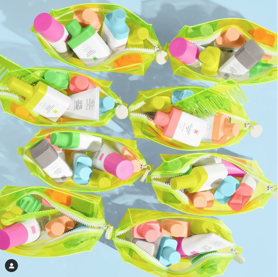
Below are a few examples of different brand palettes used by top skincare brands on social media.


There has been a surge in iridescent colours across beauty brands in 2020
Iridescence is an optical effect where certain surfaces show luminous colours that seem to change when seen from different angles. The iridescent effect feels light and magical- therefore iridescent colour schemes just make everything feel ethereal and glowing, even if it is in a medium that doesn’t change colours when we shift angles (such as computer screens).
The “Formula” for achieving an iridescent effect
There are many types of iridescent materials such as mother of pearl, bubbles, butterfly wings, fish scales or CD’s.
Each of these surfaces will have different variation in the proportion of colours and how they interact with light, but they all have several common factors that tie them together.
First, iridescent surfaces contain at least two contrasting colours that gradate from one to another.
Iridescent surfaces also contain highly luminescent colours, as in the surface colours contain little to no black.
More often than not, iridescent surfaces have colours that are very unsaturated. Which means the colours are not “pure” and include a lot grey.
In addition to iridescent, these colour schemes are often called “pearlescent,” “mermaid,” “holographic” and the effect is often being referred to as “wintery” by the biggest beauty players for winter 2020.


What are beauty and fashion brands communicating when they use iridescent colour schemes in 2020?
The first signs of the iridescent effect growing popularity came a few years ago with the #mermaidhair trend in the hair category and the unicorn trend across a range of categories. At this point and time, these rainbow palettes were synonymous with individualism and fearless originality…. these trends weren’t confined to pastel colours and they rarely coincided with the adjacent millennial pink trend that blew up around the same time.
Throughout the years, the iridescent colour schemes have not only held strong, they’ve gained mainstream popularity in adjacent categories like design, fashion and beauty due to their enchanted appearance and their ability to evoke 90’s heritage.


In fact, entering winter 2020, this trend seems to be reaching new heights.
A number of top beauty brands like Mac, Morphe Brushes, Elf, Colour Pop and Essie have released and promoted product lines featuring iridescent hues and effects.
These instances have included makeup looks that feature iridescent colours, palettes that have pearlescent shine or product packaging that incorporate holographic material.
A sparked interest in these colours could easily be attributed to a number of factors- from 90’s nostalgia, to a simple love for pastel rainbows. These colour schemes are also often the love-child between rainbow obsessed and millennial pink crazed influencers & brands.
“Homebound consumers are dedicating more time to self-care by experimenting with creative makeup looks and skincare rituals.”
But a mainstream boost of interest in iridescent colour schemes is likely birthed from a long-term change in consumer behaviour. There is a theory swimming around that lockdown has inspired a new appreciation among consumers for bright, bold makeup looks - according to Bazaar, Google searches for colourful eyeshadow looks have risen by 250 per cent since the beginning of lockdown.
And this makes perfect sense. With more people cut off from the world and spending time at home, there is a surge of beauty consumers experimenting with creative makeup looks that they see on social media… and of course makeup loving men & women with nowhere to go would be more willing to experiment with creative, out-there looks over their tame daily wear (let’s just keep those in the office).
Combine a desire with an increased need for self care and a desperate search for an escape from the pressures of 2020 and it only makes sense that beauty consumers would find these billowy, dream-like and calm palettes more appealing… or maybe we are all just looking for something shiny to combat the boredom being sitting at home…
How iridescent colours translate to skincare
“ Because a skincare product isn’t obviously visible on our faces, colour trends are more figurative rather than literal. That means colours need to communicate a completely different, often richer & deeper, message to consumers about skincare, health & beauty”
The skincare industry holds a special place in our hearts at Visibu. Rather than chasing the latest silhouette or colour palette (Seriously, NYFW 2020 trends mean little to my skincare routine), the best skincare brands focus on ingredients trends around products efficacy and that says so much more about society than a seasonal colour trend.
That means that skincare brands need to dedicate a significant amount of visual content to capturing the look & feel of “healthy” or “attractive” skin to help build trust in their products.
But just because fashion and design trends don’t translate literally to skincare it doesn’t mean that colour trends don’t leak into the category in some way or another. Because a skincare product isn’t obviously visible on our faces, colour trends are more figurative rather than literal. That means colours need to communicate a completely different, often richer & deeper, message to consumers about skincare, health & beauty. There are very few categories that are as sensorial as skincare- some that jump to mind include fragrance and nutritional supplements (which we will cover in-depth later, of course).
Homebound skincare consumers are committing to more rigorous skincare routines to achieve surreal, dewey skin
It’s certainly been a strange concoction of factors that has lead to the iridescent colour scheme finding a very special place for a group of trendy, cult-like skincare brands. In 2020, more and more up-and-coming brands are sharing a number of consumer photos featuring what appears to be very freshly washed and prepped skin.

Branded Instagram posts featuring the “Glass skin” effect
“In 2020, more and more up-and-coming brands are sharing consumer photos featuring what appears to be freshly washed and prepped skin. ”
But this isn’t your normal glow from a full-night’s rest- These selfies feature faces that resemble a 🍩 fresh glazed donut. It’s a dewiness so fresh it would have been unobtainable much less sustainable in our hectic in our pre-lockdown lives.
This glow can be traced back to a very specific trend which has been referred to in the skincare industry as “dewey,” “glowy,” “honey skin”; “cloudless skin”; “yoga skin”; and the highlighter-happy “dewy dumpling” look.
You can read more about this skincare trend in Quartz Why getting dewy skin became a global obsession
Over the last year, we’ve witnessed this trend become more mainstream as a number of American up-and-coming skincare brands began to adopt this Korean-skincare trend and making it their own. Of course, most skincare brands avoid advertising the efficacy of their products as trendy because they want consumers to believe in a philosophy. They know that a good product being adapting into a daily routine is a guarantee for repeat purchases.
It is easy to identify the brands that have jumped on this skincare trend bandwagon just by looking at their social media timeline. Although they all have their own unique approach, such as lighting styles, ingredients stories or colour proportion, they all have a few key factors in common.
First, these brands are significantly more likely to use keywords like “poreless,” “luminous,” “translucent,” “dewy,” & “glowing,”
Second, they have released a diversity of hot-selling products & kits that promise glowing skin such as Glossier’s Super Glow serum, Futuredew, Frank Body’s Rose Gold Illuminator, Peach & Lily’s Glass Skin Refining Serum or Drunk Elephant’s Dewy Kit and Glowy Kit.

Finally, each of these brands have gradually shifted their timeline colour schemes from monochromatic millennial pinks, whites & nudes towards gleaming pastel rainbows of product snaps and mood posts.
Each of these branded colour palettes are highly luminescent, undersaturated, and high contrasting. You will notice that the colours are far more subdued than the fashion and beauty industry examples above, this is typical for skincare brands to use very light palettes as it communicates purity, translucence and luminosity- all desired effects from your skincare routine.


With the power of colour, it’s no surprise that this colour scheme would be the way that marketers and brand designers communicate a very specific, highly desirable skin trend.
But glowing, iridescent palettes aren’t the only trick being used by these brands to lure glow-thirsty boys & girls.
Tucked between the glowing, luminous rainbows of product photos and pink sunsets are photos and videos of consumer generated content (UGC) featuring dreamy and ethereal skin.
Consumer shared videos featuring dewey faces turning to capture the light across their brows, nose and cheekbones serve as proof that the product will really deliver translucent, dewey skin.

Videos that demonstrate how the surface of our skin interacts with light as we shift our head from side to side also speaks volumes about our new found love for the iridescent illuminating effect of a rigorous skincare routine.
It’s the combination of these factors that really tells us the desired product benefits that content creators are trying to communicate with consumers (subconsciously) when they use these palettes on their timeline.
Deep dive into a product post
Because it is skincare, you don’t necessarily want to be literal when you use this palette. Instead, you want to allude to the iridescent effect to make your branded visuals feel light, airy and whimsical…

Let’s take a look at an image from Drunk Elephant’s Instagram account
In this image, four products have been lined up pedestals.
Behind the products is a backdrop in very soft, pastel pink and yellow gradating colours.
Although the image’s colour palette is soft the image still feels very dynamic and lively.

Extracting the colour palette:
When the colours are extracted from the image you can see the dominant colours include yellow, blue and pink (white has been excluded in this palette).

Understanding the colour relationship:
If we take put these colours on the HSL colour wheel, you can see a clear colour relationship. This is a split complementary colour scheme.
By incorporating split complementary themes, Drunk Elephant has created a very dynamic and lively look & feel.
But they’ve kept it feeling calm and skin relevant by keeping the colours soft.
How to make this trend yours
We’ve covered a number of brands that have achieved a similar effect, but notice how each brand uses visual elements like colour proportion and relationships to make their scheme unique to them.
There are many ways that you can create an iridescent effect while keeping true to your brand palette so that visuals are recognisable as yours.
“By analysing and understanding popular colour trends, brands can create better strategies to appeal to their audience while differentiating themselves.”
If luminous, glowing, or brighter skin is a product benefit you want to play on, consider taking advantage of this colour scheme. Especially if the bright, cheerful colours fits your brand pillars.
Because iridescent colours include dynamic colour relationships that are moderately saturated and very light, it’s best if you start with your own logo or brand colour as a “base” colour (ie the colour you use in the highest proportion).

Updating the Tatcha logo to achieve an iridescent colour scheme
For example, if your logo is purple, start by using the colour picker tool in any software to lower the saturation and increase the brightness of your brand colour. It’s easiest if you do using the in HSB mode (Hue Saturation Brightness).
Then you can use the updated colour in a colour harmony tool such as Paletton.com to select other colours that create a dynamic effect. You can also do this manually by adjusting the hue first for each colour until you achieve the desired effect.
You can now put your new colour scheme in your branding guide or Canva to serve as a tool for graphic designers and photographers before they source backdrops and props. You can also share this palette with brand ambassadors and partners to encourage them to incorporate this scheme in their sponsored content.
Ways to incorporate colours into your content strategy


Get Creative with product photography & videos through props, backdrops & lighting
From coloured backdrops to props and lighting, you can easily incorporate elements that add a splash of colour to your products.
The effect is even better if your product incorporates a relevant colour that you can play off, or if your product has a colour that is neutral (such as white) so that you can make it really glow.
Source mood-posts that capture your palette
Sourcing mood-posts is another way that you can really connect with your audience and bring your aesthetic to life.
You can use a wide range of subjects to do this-whether it is a bouquet of flowers, a movie shot, a relatable meme or a snap of your dream house…. just be sure to pick brand-relevant subjects and to adjust the colour settings to match it perfectly to your palette. Also, give credit where relevant.


Incorporate colours and textures in timeline quotes & Instagram stories
Never underestimate the power of a good quote- especially if the quote is relevant and topical to consumers.
In addition to inspiring and topical quotes, consider creating content that answers questions or educates consumers about your product or general skincare.
Canva is a great tool for doing this- just be sure that you are consistent with your fonts if possible.
Do you want to improve your brand equity?
Visibu is a London-based social analytics and strategic branding firm that uses social media tracking, image processing and AI to identify and break down content marketing and design trends.
If you’re looking to organically grow a million-dollar brand, then we could be the partner for you.
Subscribe to our blog and receive thought provoking content on brand design and content marketing across a wide range of industries.